Art Direction and Branding for BPC. A fintech company that enables real life transactions with their banking, payments and commerce platforms.


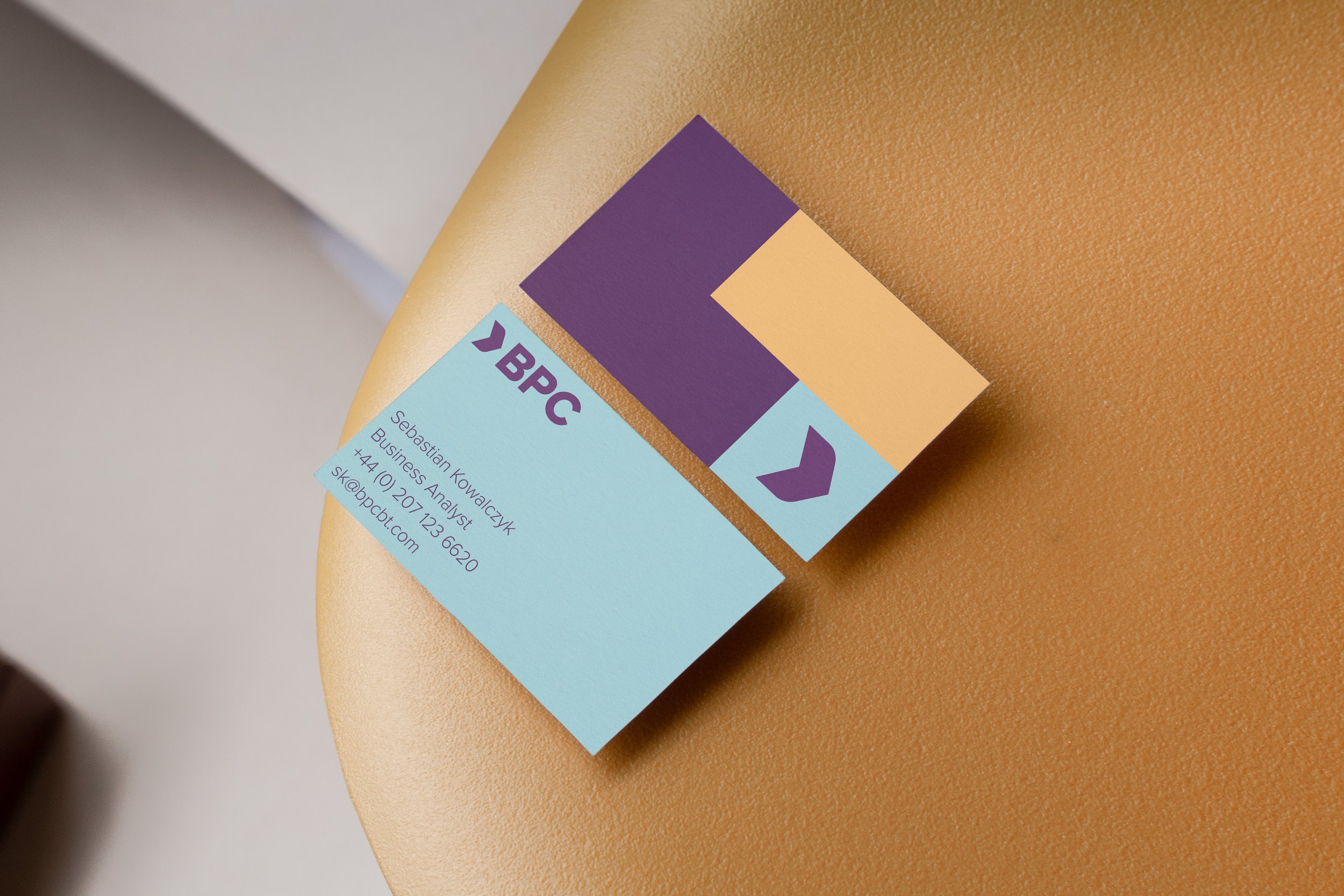
When I was asked to develop the rebranding for BPC, I knew it had to be an identity as strong as the name, while still representing the idea of the original logo. By flipping the symbol it embodies the idea of BPC’s values dare, care and share, and shows an emotion of going forward in transactions. The overly nature of the new logo is strong yet still perceived as approachable.


Color speaks and color confronts, it has meaning and sets you appart from others. The color scheme has been researched to represent the lively vivid colors of the very broad range of nationalities BPC serves. Purple is rich and deep, representing loyalty with the vivid colours representing the various continents they serve.
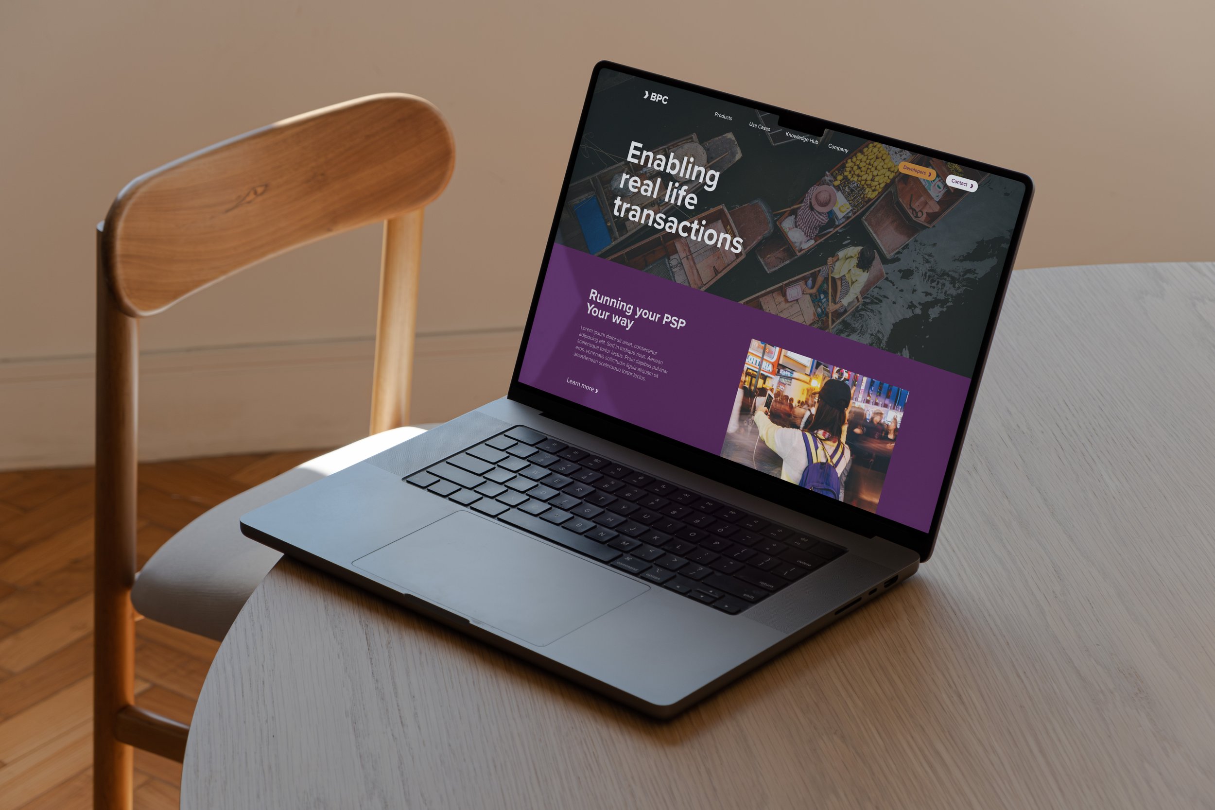
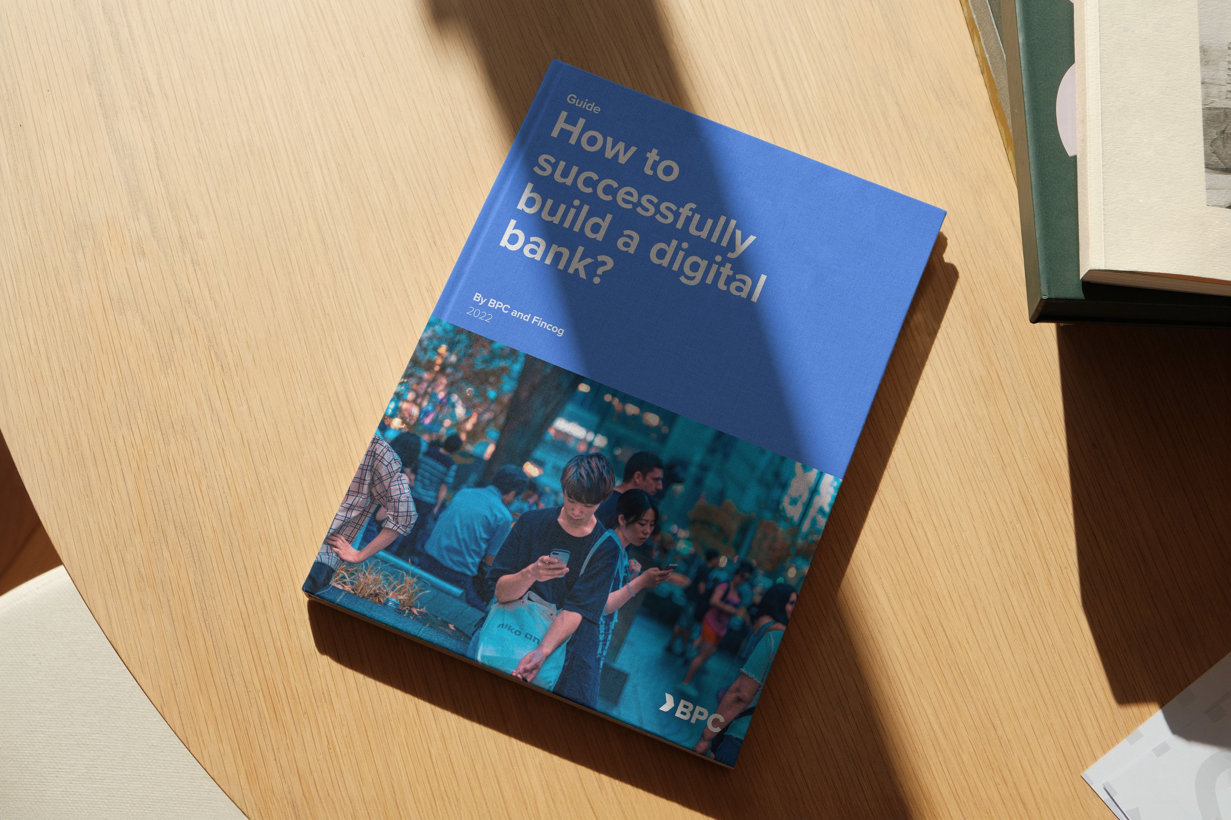
The physical and digital presence of the brand shares a unique, flexible design system—a design system that embodies the ‘real life transactions’, and clarity of information that BPC provides.

In cooperation with RedSnap Inc. a specialized agency for fintech branding, marketing, and sales, serving companies with a global footprint.

