Branding & Design
BPC Branding
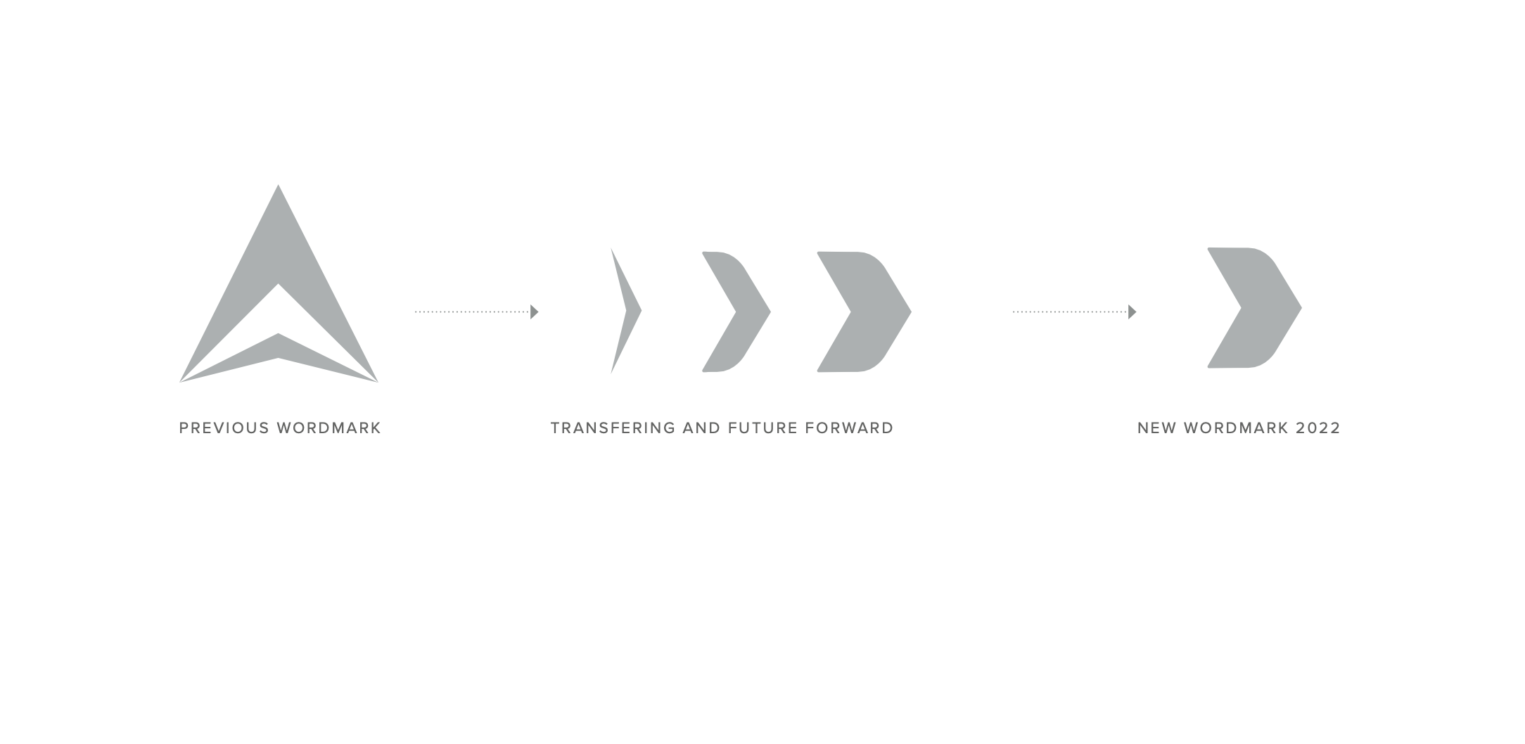
BPC required an identity that felt as strong and confident as its name, while still respecting the essence of the original mark. The goal was not to replace what existed, but to reinterpret it in a way that reflected the company’s evolving vision.
The logo concept grew from the idea of movement and exchange — a visual gesture that suggests progress while remaining grounded and balanced. By reworking and inverting elements of the original symbol, the mark introduces a sense of forward direction while maintaining a connection to the brand’s history.
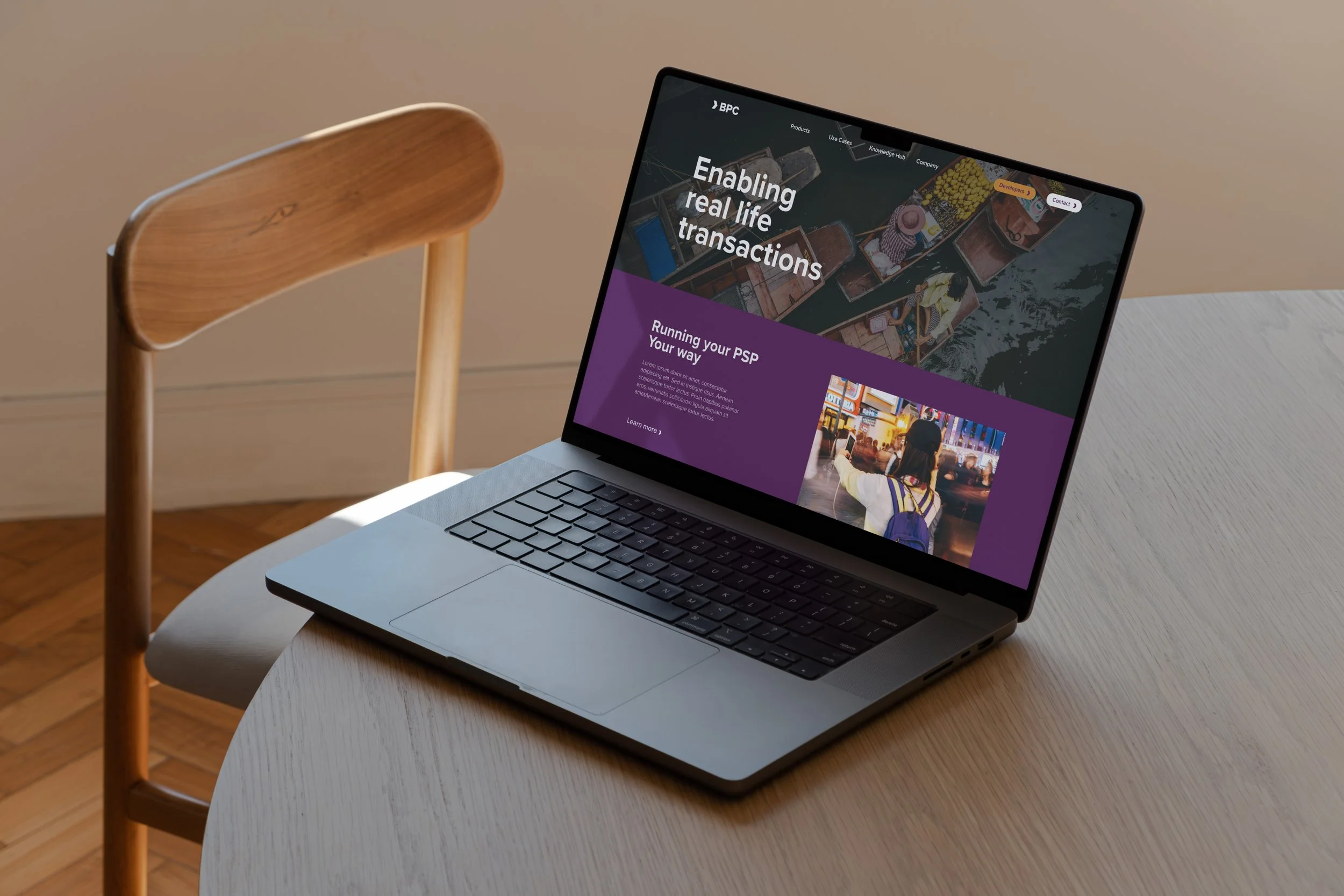
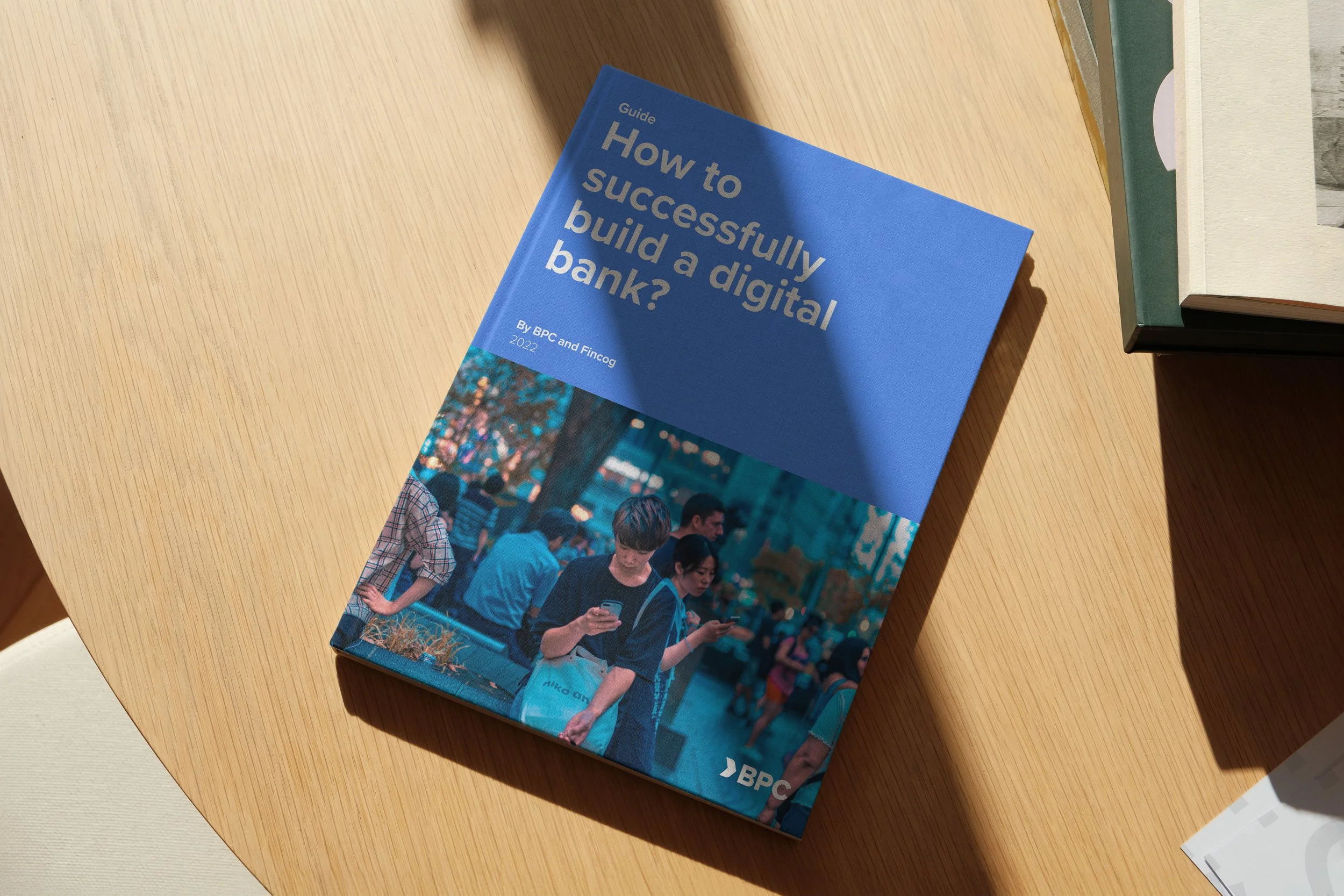
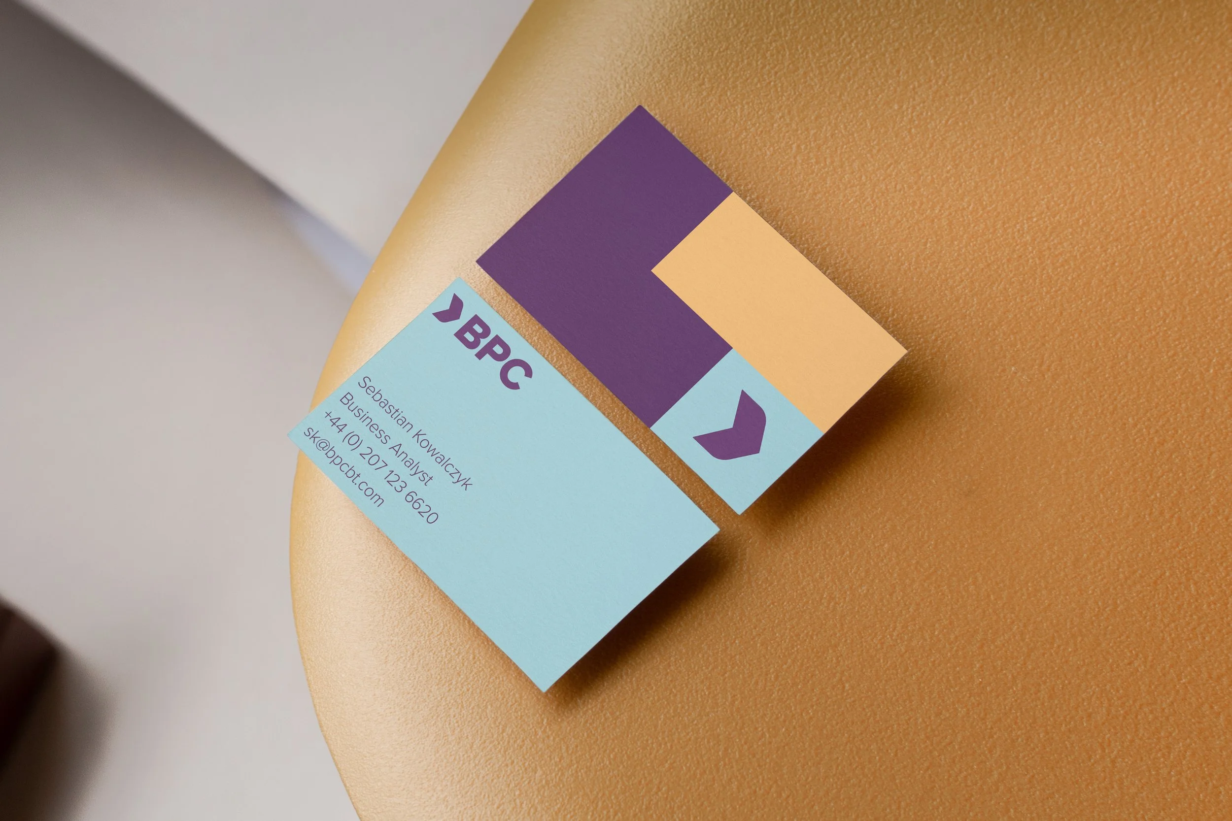
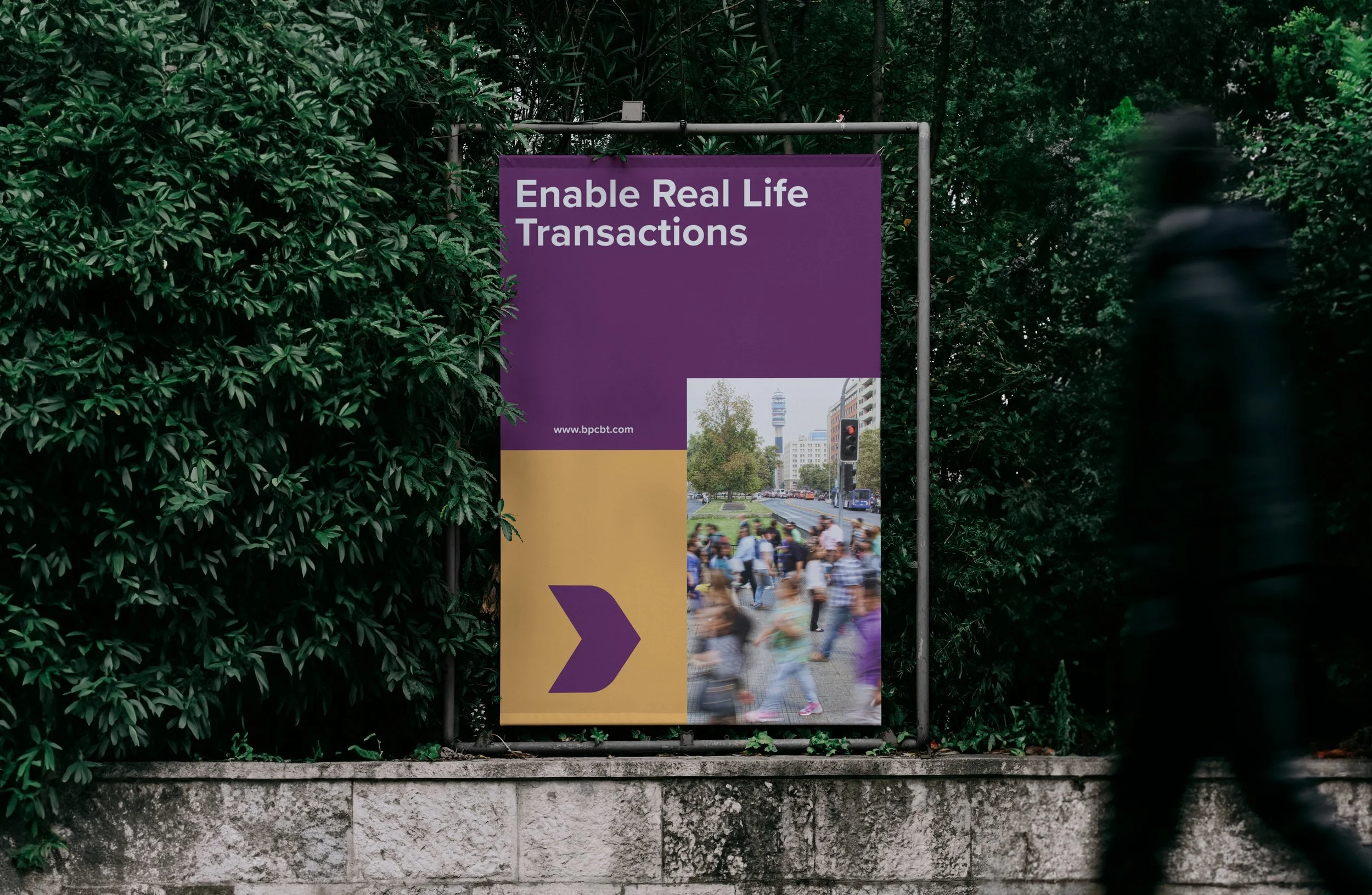
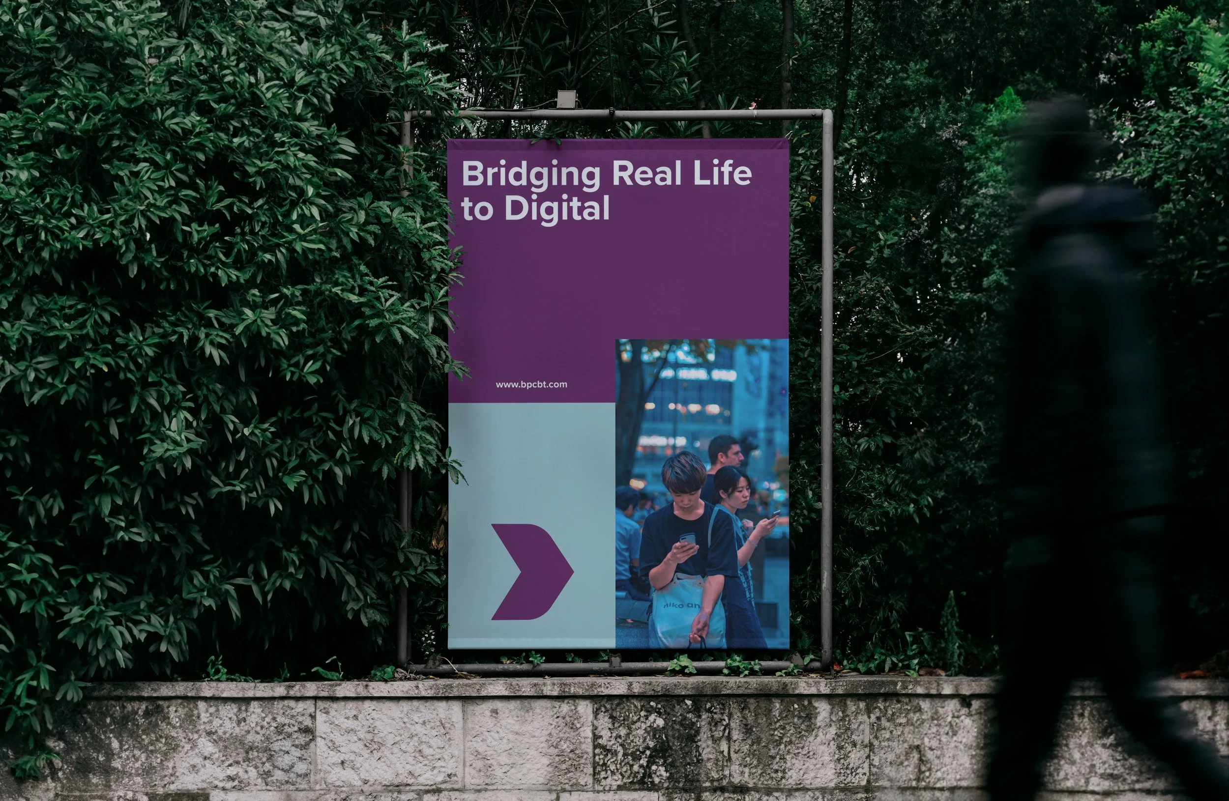
Beyond the logo, I developed the broader visual identity and art direction across a range of brand touchpoints, from printed materials such as booklets and flyers to digital applications including the website and social media. Each element was designed to work together as part of a cohesive system, translating the identity into a consistent and recognizable brand experience.
The resulting design balances strength with openness. Its structure feels bold and deliberate, yet approachable, reflecting BPC’s values while communicating momentum, trust, and a clear sense of progress.